Reddit is about to enter the arena of walled gardens when they release their new design to all users. The process started 2 years ago when the site decided to start hosting images, gifs, and videos in an attempt to keep their users from going to their long-time partner website Imgur and other content hosting social media platforms like YouTube. The next phase is very reminiscent of what Google, YouTube, and other websites have done under the guise of being ‘mobile-friendly’ but in reality is likely built to keep traffic on the Reddit website and in front of advertisers as much as possible. The new redesign uses a card based layout to highlight content (and ads) one or two at a time instead of the list of links Reddit has been known for since 2005.
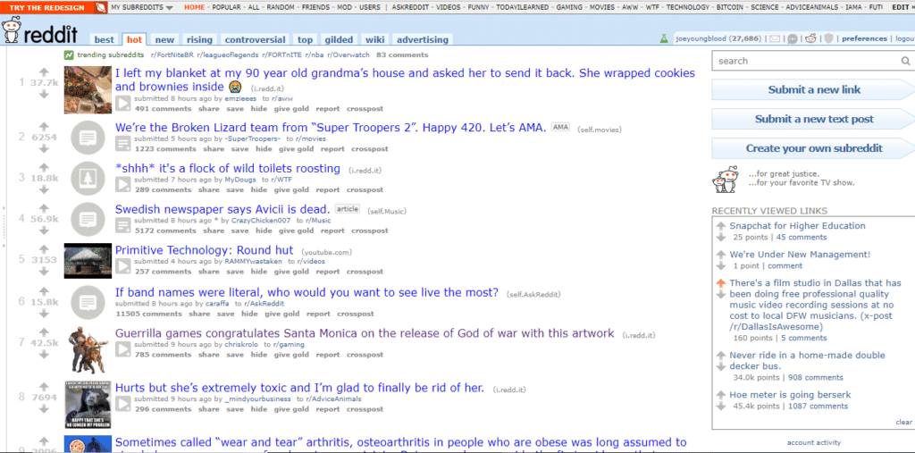
To understand the impact of this design change first look at this screenshot of the homepage in its current original form as viewed on a 15″ laptop at 1366×768 resolution in Chrome on Windows 10. (note I am not using Reddit Enhancement Suite so this is what the homepage looks like to a normal site visitor)
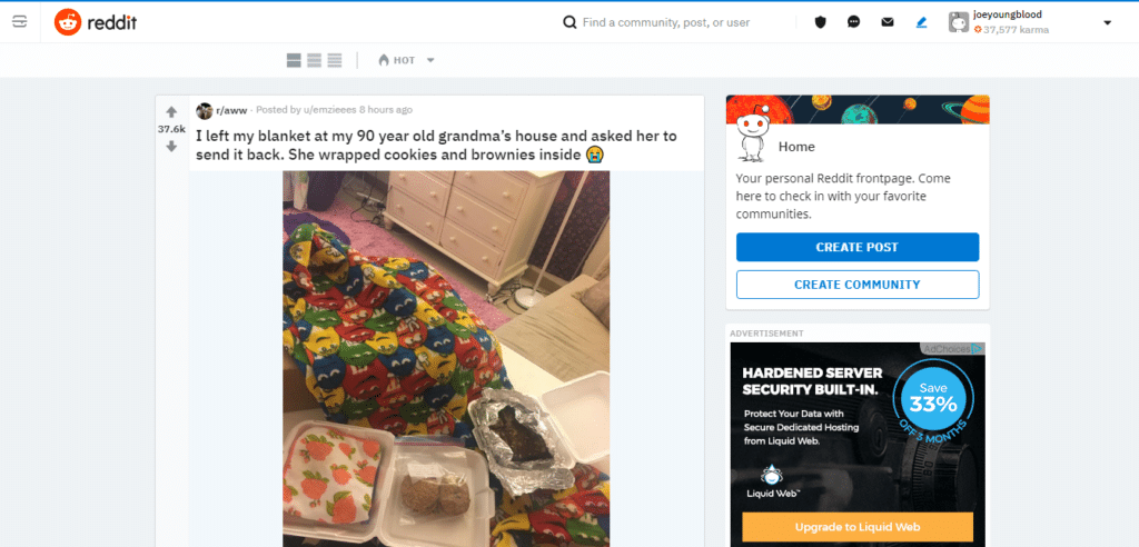
And here is the same exact frontpage screenshot using the new design again on the same 15″ laptop screen at a resolution of 1366×768 in Chrome on Windows 10.
With the current (old) design users see about 9-10 posts above the fold on a standard laptop screen, with the new design those users will only see 1-2 posts above the fold on the standard laptop screen. This will have the ultimate effect of users seeing fewer pieces of content, but engaging with those fewer pieces of content more. This was employed by Facebook years ago to get more visibility for publisher created content before taking that away and charging for it.
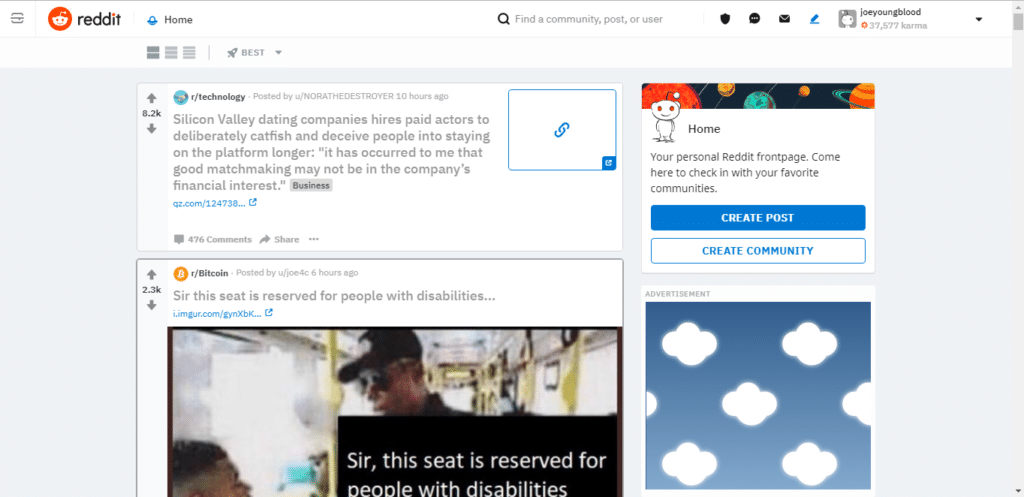
The worse part of this redesign, however, is what Reddit is doing to links. Currently Reddit is the only major social media website where links to other websites comprise a majority of the content on the site. In this new design Reddit has decided that for users to reach your website from a shared link that they will have to click a large linking chain graphic next to the title of the article. This is a major change to how the site currently works. Currently the title of the article links directly to the article the user has shared and the ‘comments’ link below it links to the forum conversation on Reddit.
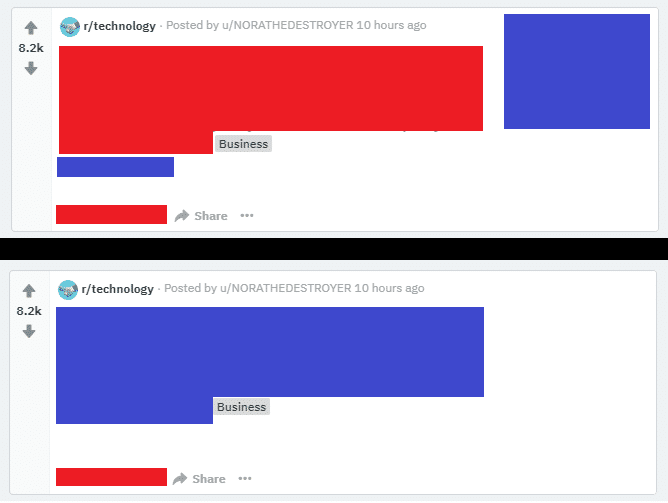
This redesign has only one clear purpose and that is to keep users from clicking the links to visit other websites and instead try to keep them on Reddit longer by forcing them into conversations on the website. Here is what this looks like on the same laptop screen.
In this graphic I’ve attempted to show what the usability of links on Reddit looks like now compared to how it would have looked if the redesign didn’t change the way it works. The top graphic is the new redesign and the bottom is the old logic displayed as the new redesign. Red = links to Reddit.com and Blue = links to the website the article was published on. You’ll notice the top graphic has a lot more color, but a lot more red than blue and the bottom graphic has more blue than red and less color. Reddit knows that users are more likely to click the title of the article and to click in the middle of the card with the link information on it. To this end they have optimized this display to encourage users to click through to their comments section and ignore the content of the article itself.
They have provided a small link below the article title, much like Google does with their feature snippets and knowledge panels.
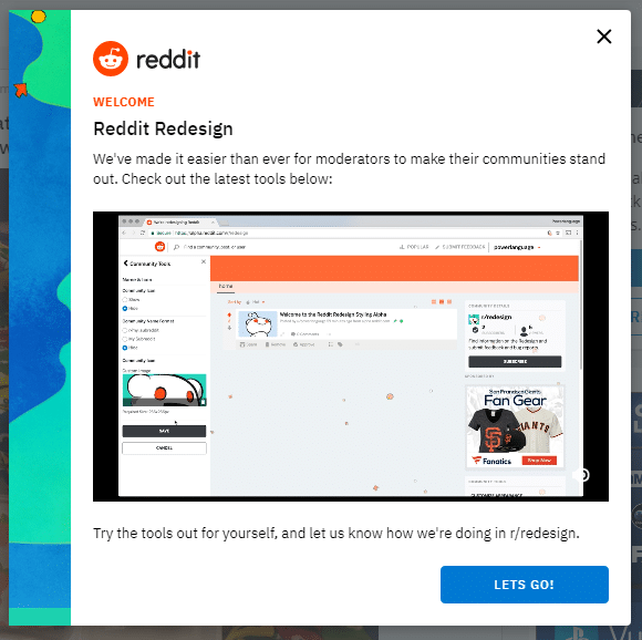
Reddit is trying to sell the redesign to moderators telling them that it makes their subreddit’s better, but as a subreddit moderator I have to disagree, and I am not the only one. This redesign has been very unpopular with beta testers and with many who have tested it out.
Reviews of the Redesign by Redditors
Why does this whole redesign feel like Google built it?! There is SO much wasted space on my screen now… And WHAT is going on with everything being so big and clunky?!
The Reddit Desktop Website Redesign is Atrocious. WHY on earth are you guys doing this? Please stop.
There’s no point in complaining about the redesign. We’re not the audience Reddit is trying to attract. They couldn’t care less.
This is, without a doubt, the single worst website redesign I have ever seen in my life, and I used to work in mobile development.
This video was released yesterday and made the Frontpage of Reddit this morning with 14,000 upvotes. The creator does a comically good job of highlighting some of the problems with the new design and the general sentiment of Redditors that it is not liked.
This redesign is just another step into making Reddit more Facebook-like. The social media site has taken several steps in that direction over the past 2 years including:
- Allowing users to subscribe to each others profiles (similar to ‘friending’ or ‘following’)
- Allowing users to post post to their profiles (similar to making a facebook status update or a tweet)
- Adding profile photos
- Introducing /r/popular
- Adding a ‘Best’ tab to the frontpage (which works much like the News Feed for logged in users)
- Making the ‘Best’ tab the default of the frontpage without the ability to change it
- Hosting their own images, gifs, and videos
- Adding peer to peer chat (currently deprecated feature)
- Adding chat rooms for subreddits (more targeted against Discord)
- Placing ads directly into the feed of content on the frontpage (redesign)
- Designing the website to highlight one piece of content at a time (redesign)
This redesign is happening whether or not the Reddit community likes it, much like their predecessor Digg, Reddit has largely ignored the panning of the design and only seems to be accepting the positive feedback. This time though, there doesn’t appear to be a good alternative to stop it.
If driving traffic from the frontpage of Reddit or from a subreddit was part of your social media strategy or simply has been beneficial to you in the past, then you have declining traffic volumes to look forward to in the near-future as Reddit pushes their platform to be more and more pay-to-play.
You can keep up with the Reddit redesign notes and feedback on the /r/Redesign subreddit: https://www.reddit.com/r/redesign/
