Twitter has started rolling out their new design on desktop which has been in testing for several months. So far the reaction from Twitter users has been less than positive.
As I’ve been saying on my YouTube series, The Week in Digital Marketing (so far), the design feels distracting and messy and only designed to force engagement with trending topics. Others have pointed out that Twitter is possibly attempting to merge the look and feel across devices, similar to what Microsoft did with Windows 8 and their failed Windows Phone. This has become a common, heavily disliked, trend in website design recently. As mobile has solidified itself as the top device type accessing the web, large websites like Reddit, Dropbox, and Twitter have released desktop redesigns in an attempt to make the usability on desktop more like their mobile versions.
One Twitter hero has found a solution to this issue (or at least was the most liked / RT’d version of this), albeit a cumbersome one likely to be killed by Twitter any day now.
You can speed up this process by going directly to the “Directory” page Rick Mentions here: Twitter Directory page
Here are the steps:
- Click on “More” in your left-hand navigation at the bottom
- Now click on “Settings and Privacy”
- The select “About Twitter”
- And click on the link titled “Directory” which will open a new tab
- Once on this page click on “Home” and Twitter will load the old design with the Twitter home page.
Unfortunately this change isn’t permanent and the moment you click “home” or any other link I’ve tested so far, the design will revert to the new Twitter design.
I tested this out and it does work
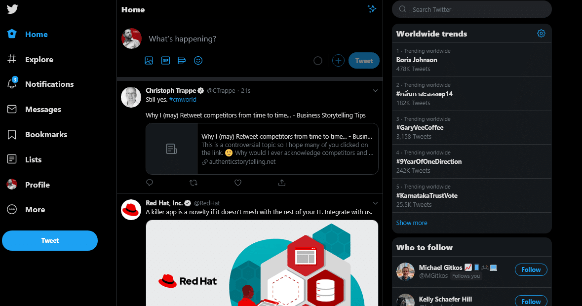
Here is my homepage with #NewTwitter design
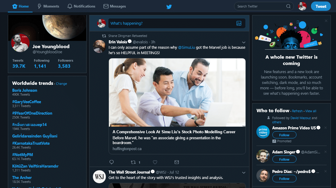
And here is the homepage after following Rick’s directions
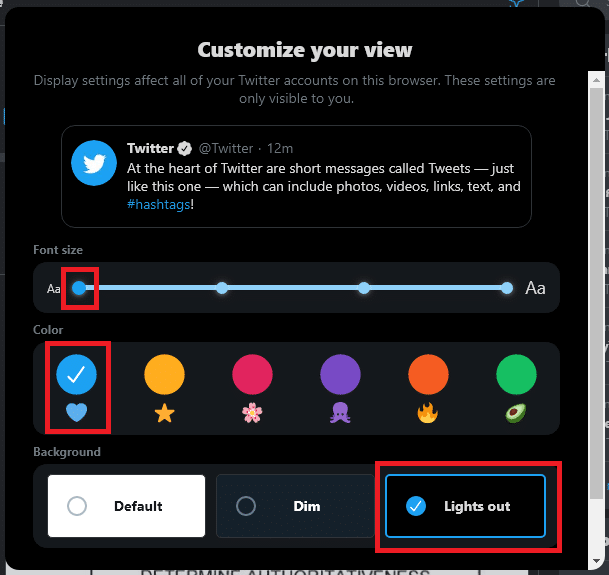
If you’re not interested in going through those hoops and are willing to use New Twitter but hate all of the empty space and the how large everything on the page is try using my design settings
And then use your browser’s zoom function to find a zoom level that works for you. I have mine set to 90% so I can see more of the screen without feeling like the old 800×600 days.


