WARNING: This article contains a discussion about U.S. Presidential Candidates in the 2020 election. It is not meant to endorse any candidate or their issues. It is also not meant to disparage any candidate or their voter base. This is only a look at each of the main candidate for President’s 404 page on their website and how that is fitting into their campaign marketing strategy. Our goal is to remind marketers and business owners that a 404 page is still a useful part of Digital Marketing and SEO today. As such any comments about a politician, party, ideology, etc… will be removed.
404 pages have become a marketing tool for politicians in recent years allowing a candidate to showcase their stance on an issue, display a sense of humor, attack a rival, drive donations – or a combination of those. Now that the stage appears to be set for the big election we wanted to examine the 404 pages used by each candidate along with any associated marketing to create a historical account of this small part of digital marketing.
According to Ballotpedia as of August 3, 2020, there were 1,164 candidates from 35 different political parties and 4 different groups of non-party affiliation (independent, other, unaffiliated, nonpartisan) who officially filed to run for President with the Federal Election Commission.
We’re only going to examine the most notable (and/or interesting) candidates 404 pages from; the Republican Party, Democrat Party, Libertarian Party, Birthday Party, Green Party, and Constitution Party.
The 404 Pages
1. President Donald Trump – Incumbent, Republican
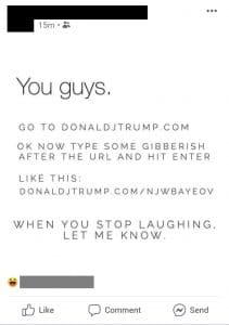
President Trump’s marketing for the 2016 campaign and 2020 campaign have both relied heavily on “memeing” against the competition. This is a stark contrast to earlier Republican campaigns which have relied for decades on winning over American voters with grounded conservative principles or moral arguments. So, it should be no surprise that the 404 page on his website is designed to be a bit of edgy humor targeted to his loyal memesmithing audience while also taking the opportunity to attack his top challenger.
The page offers little in terms of navigational help and the button is a tad confusion reading “return to the homepage” as if the user just came from the homepage and not a broken URL somewhere on the web.
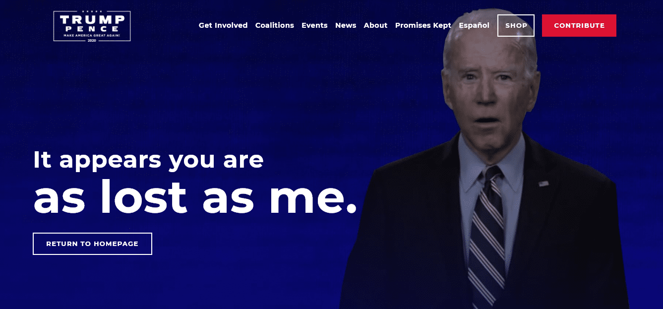
This is then paired with a more bland text meme going around social media encouraging users to visit the 404 page. A clever usage of a 404 page and a meme to both reinforce a political decision and make a political attack.
2. Vice President Joe Biden – Challenger, Democrat
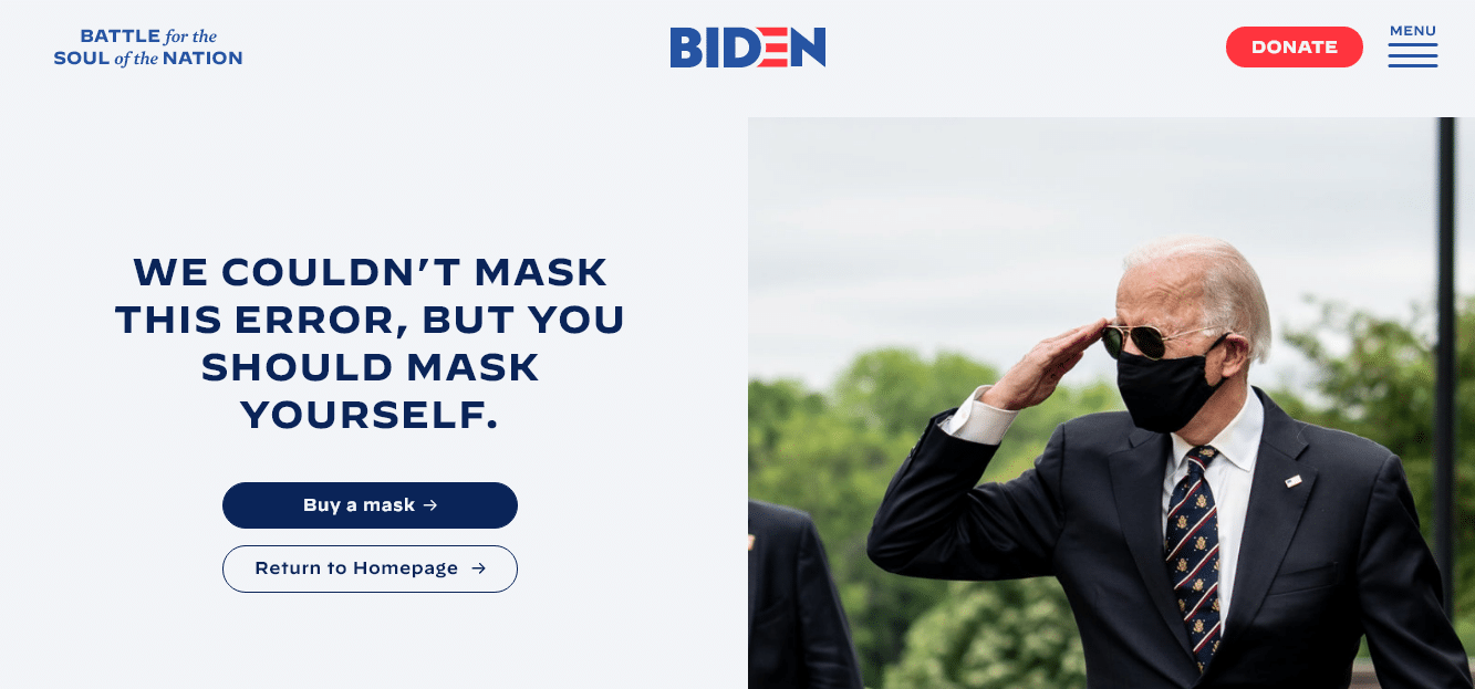
The Democrat contender has been very serious this cycle with Vice President Biden cracking very few jokes and approaching issues with a serious attitude. The 404 page offers a different feel for the candidate in that it tries to use humor to support wearing face masks while also trying to use them to generate donation revenue. The page offers even less in navigation (on desktop) than the Republican candidate’s page, offering only a hamburger menu icon and a button that also erroneously reads “return to the homepage”
3. Jo Jorgensen – Challenger, Libertarian
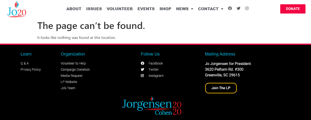
The Libertarian Party has gained a lot of visibility in recent years as disaffected Republicans and Democrats alike seek out parties that might more closely align with their mixture of traditionally conservative and progressive values. The party has also done really well in recent years gaining attention on social media with compelling videos and memes commanding a Facebook page of over 700,000 followers where videos routinely get tens of thousands of views and an Instagram account with over 85,000 followers. It’s this recent history of well-done social media and digital that makes their candidate’s 404 stand out – for all the wrong reasons.
It appears to be nothing but a basic 404 message sandwiched between the header and the footer of the site.
4. Kanye West – Challenger, Birthday Party (seriously)
Kanye West is a legitimate FEC registered Presidential candidate with his own brand new party, the Birthday Party. Kanye does not have a presidential candidate website nor does his newly founded party have a website. However, he does have an official website with a link to Vote.org and a video showing people how easy he was able to register to vote at a county clerk’s office in Wyoming where he has a massive ranch. Yezzy’s website is incredibly minimal with one music video and his voting video and that’s it, recently his brand “Yezzy Supply” made news for building an ecommerce website that wouldn’t use any text and had interactive graphics. It’s that sort of artistic innovation that would make you expect an incredibly creative or possibly minimal 404 page. Instead, we actually get an error message from Amazon’s S3 along with the 404.
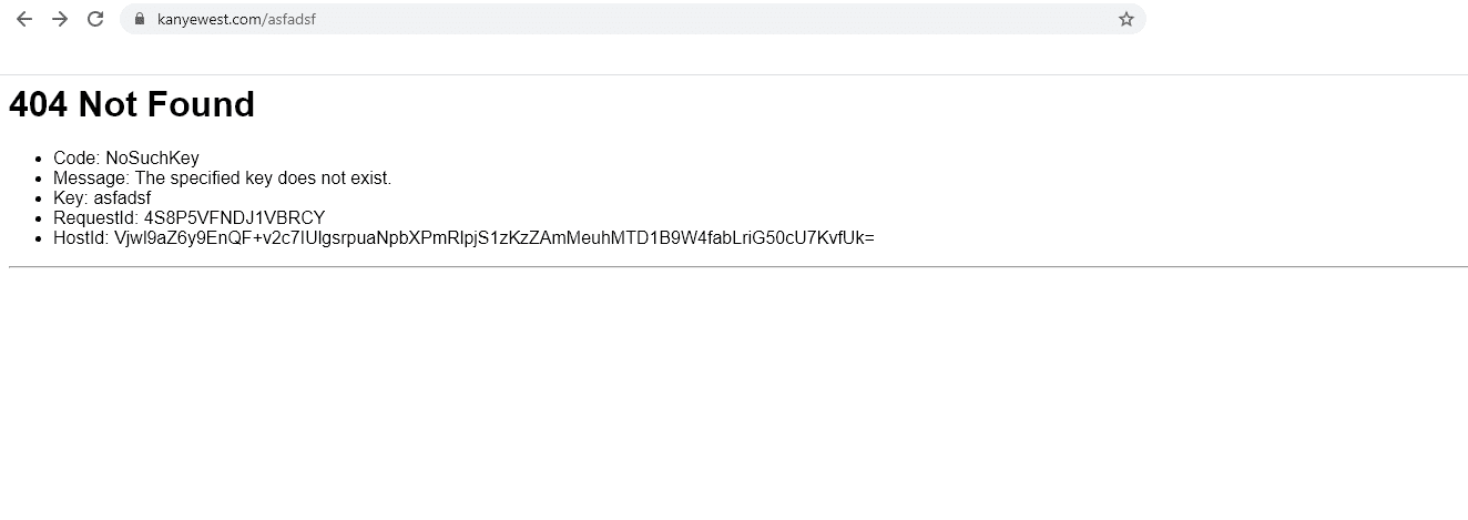
It would appear Mr. West’s team did not create a custom 404 page for his website and we’re seeing the standard 404 page from Amazon S3.
5. Howie Hawkins – Challenger, Green Party
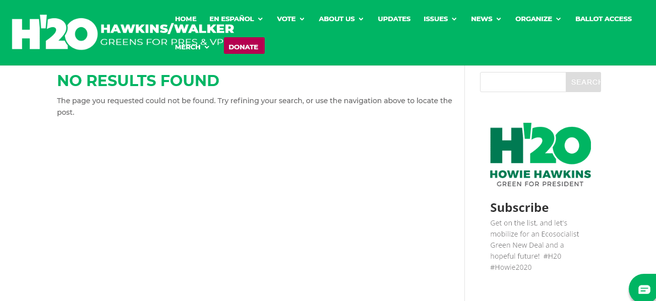
The Green Party website is a lackluster experience with layout shifting, a crowded desktop menu, text overlapping, and mid-quality graphics. There were zero surprises when the 404 page was just a standard stock page. It’s pretty much known a Green Party candidate isn’t going to win the current election cycle, so this probably isn’t causing any immediate pain, however, a minor party trying to build a vibrant base should focus on winning over future members – great design will go a long ways towards doing that.
6. Don Blankenship – Challenger, Constitution Party
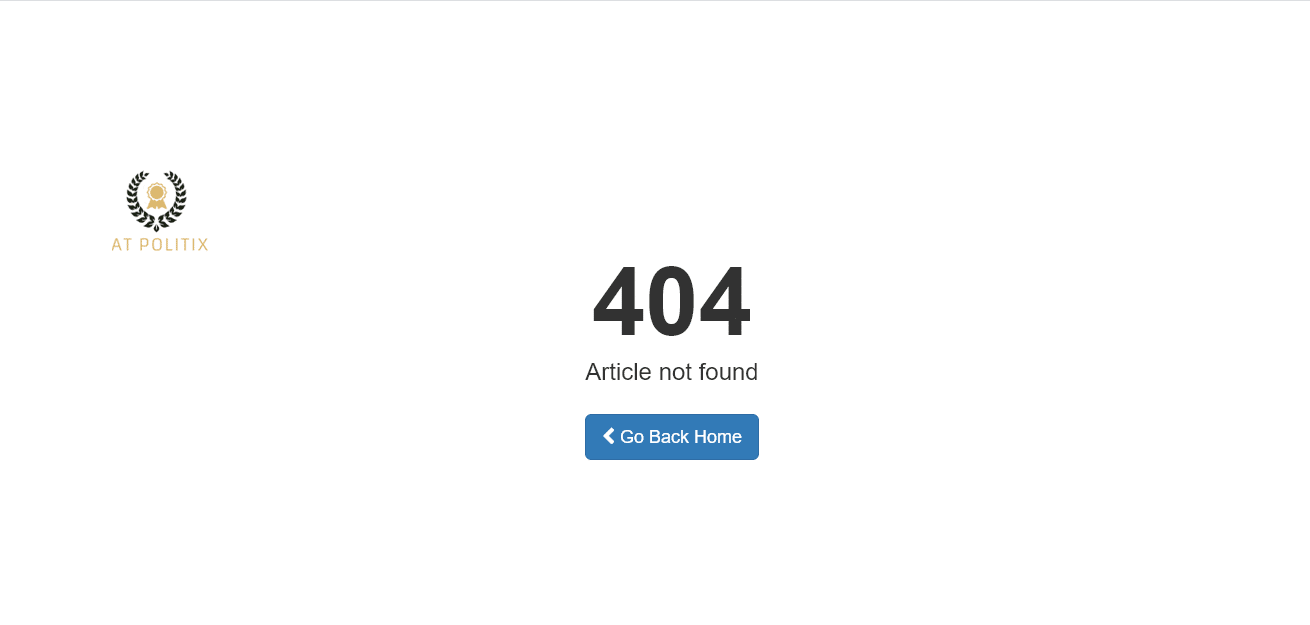
The Constitution Party is pretty much invisible to most Americans and after seeing more visible parties and candidates fail to build a 404 page, it was refreshing to see the Constitution Party actually had one. Their 404 page is clean and minimal, a decent entrant though not particularly compelling in any fashion. There’s one last twist though, you’ll notice an emblem off to the left-hand side of the page that has the words “AT POLITIX” below it. This is the logo for a Joomla theme called “AT POLITIX”, this is a default 404 page that comes stock with that theme. The Constitution Party is likely unaware that this page even exists.
What We Learned
Most party candidates in the U.S. do not appear to see value in a custom 404 page to help spread their message or support their campaign. Those that do, tend to focus on using the page to push one singular message and to keep navigation options as limited as possible. It’s probably no accident that the two major U.S. political parties are the two that have custom 404 pages while their smaller counterparts and new entrants are less familiar with using every tactic possible to garner content spread, conversations, donations, and ultimately votes.
I recently polled my Twitter audience to see who they thought would be responsible for making these pages and/or the failure to do so, and a commanding 49.5% thought it clearly fell under Web Design (or UX or related fields) while others thought it might fall under Technical SEO, General SEO, or even Content Marketing. Whoever is in charge of the page, not having a customized one is a clear failure for someone hoping to be the leader of a country and shows a complete lack of technical understanding by either a candidate or their team (that last part is my personal opinion).
Note: This is a Twitter poll and should be treated as such and not as scientific, statistically sound, research.
All political candidates for President with a custom 404 page use button text that makes it sound like you clicked a broken link on the homepage, this feels like something that hasn’t been thought through very well.
A great 404 page should offer the user an ability to find what they were looking for as quickly as possible to avoid losing them. This is often accomplished with a nice search feature, a list of most popular content, or a sitemap.
Candidates for office might also try and offer a button that takes users to their stances on issues.

